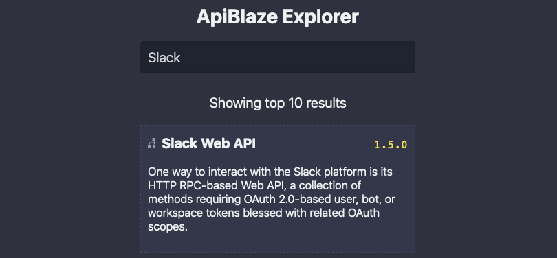
ApiBlaze is a tool to explore API specifications: Search for a keyword, filter for objects, properties, or endpoints, and immediately see descriptions and code examples. ApiBlaze helps you to answer a specific question about an API lightning fast. You can try it here: apiblaze.admantium.com.
In the last article about ApiBlaze, I described how the general refactoring of my early ApiBlaze prototype happened in order to use my custom JavaScript framework called SPAC. When ApiBlaze is started, the first page is the API search. It features a central UI element: The search bar. After a few keystrokes, the user input is compared with the set of OpenAPI specifications. You see the API names, a small icon, and its description. The user input is highlighted in these results. Then, by clicking on one of the search results, or by using the navigational arrow keys, you can browse and select an API.
With these features, the following requirements will be fulfilled:
- SEA01 - Search for APIs by keyword
In the next sections, we will detail the implementation, beginning with the data model and search functions, and finishing with the HTML and CSS of the page.
Data Model
ApiBlaze searches for API specifications in the OpenAPI format. This format is a specific JSON or YAML file that contains all API endpoints, its data model, properties and descriptive texts. The database for these specifications is a fixed, all specifications are bundles with the application.
Let’s take a look at an example to figure out where to search in an OpenAPI specification and in which data fields the search should be done. Here is a short example of the Slack API.
{
  "externalDocs": {
    "description": "Learn more about the Slack Web API",
    "url": "https://api.slack.com/web"
  },
  "host": "slack.com",
  "info": {
    "contact": {
      "name": "Slack developer relations",
      "url": "https://api.slack.com/support"
    },
    "description": "One way to interact with the Slack platform is its HTTP RPC-based Web API, a collection of methods requiring OAuth 2.0-based user, bot, or workspace tokens blessed with related OAuth scopes.",
    "title": "Slack Web API",
    "version": "1.5.0"
  }
  "basePath": "/api",
  "paths": { ... },
  "definitions": { ... }
The challenge with OpenAPI specifications is that the majority of its fields are optional - except the sections paths and definitions that contain the API details. Therefore, the search model is the complete API specification expect the paths and definitions sections.
Search Function
Searching is done in three steps:
- build a stringified representation of the API specification
- build a list of matches that includes all APIs in which the users keyword(s) occur
- rank the search results by the number of occurrences.
The first two steps can be handled by a function as shown here:
const matches = []
const scoredMatches = []

// traverse all apis, save matches
for (const [apiName, apiInfo] of Object.entries(apiList)) {
  delete apiInfo.definitions
  delete apiInfo.paths

  const apiText = JSON.stringify(apiInfo)

  const nameMatch = apiName.match(keywords)
  const apiInfoMatch = apiText.match(keywords)

  if (nameMatch || apiInfoMatch) matches.push({ apiName, apiInfo })
}
The third step is realized by forming a regular expression of the keyword and counting the number of matches.
matches.forEach(api => {
  const { apiName, apiInfo } = api

  const searchText = apiName + ' ' + JSON.stringify(apiInfo)
  const score = searchText.match(new RegExp(keywords, 'mig')).length

  const apiDescription =
    apiInfo.info && apiInfo.info.description
      ? apiInfo.info.description
      : apiName

  scoredMatches.push({ apiName, apiDescription, score })
})
The data model is done - lets continue with the design.
Index Page Design
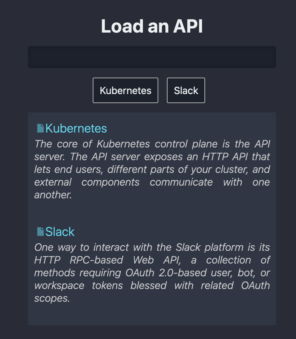
The initial start page contains only minimalistic HTML: A single <div> with class .container and the id #root-container to which the search bar component attaches its DOM.
<div class="container flex flex-center" id="root-container"></div>
The styling for the page uses a dark background, bright fonts and highlight colors. The container is displayed as flex with its items centered.
.container {
  background-color: #292c36;
  border-radius: $border-radius;
}

.flex {
  display: flex;
}

.flex-center {
  align-items: center;
  justify-content: center;
}
API Search Page Design
The API search page holds is rendered in its parents #root-container. It itself contains two divs: #root-api-spec-search-bar- and #root-api-spec-search-results. In these <divs>, the respective components are rendered.
<section>
  <div id"api-spec-search-bar" class="api-spec-search-bar"></div>
  <div id"api-spec-search-results" class="api-spec-search-results"></div>
</section>
Search Bar Component
The search bar component has a <h2> and an input field with #api-spec-search-bar.
<div id"api-spec-search-bar" class="api-spec-search-bar">
  <h2>Load an API</h2>
  <input type="text" id="api-spec-search-bar" placeholder="" value="" spellcheck="false" />
</div>
The search bar has conventional styling effects: Its border is accentuated when the element is highlighted
The visual aspects of the search bar are its fonts and its hover/focus effect.
api-spec-search-bar {
  width: 400px;
  padding: 10px;
  background-color: #1d212b;
  margin: 10px 10px;
  color: #ccc;
  border: 1px solid transparent;
  box-shadow: 0 0 5px inset rgba(0, 0, 0, 0.2);

  &:focus,
  &:active,
  &:hover {
    color: #fff;
    border: 1px solid #09f;
    outline: 0;
    box-shadow: 0 0 5px inset rgba(255, 255, 255, 0.2);
  }
}
Search Results Component
The search results are rendered immediately below the search bar. This is again a <div>, with a number of <a> link tags, in which icons and texts is rendered.
<div id"api-spec-search-results" class="api-spec-search-results">
  <a>
    <i>{{ $icon }}</i>
    <span class="heading">Kubernetes</span>
    <span class="description">The core of Kubernetes control plane is the API server. The API server exposes an HTTP API that lets end users, different parts of your cluster, and external components communicate with one another.</span>
  </a>
</div>
The styling is more complex: The icon and the .heading span are rendered on the same line, with a custom color. The .description is displayed in an emphasized font type. Hover effects accentuate the element.
.api-search-results {
  text-align: left;
  width: 400px;
  background-color: #303644;
  color: #ccc;

  a {
    display: inline-block;
    cursor: pointer;
    padding: 5px;

    &:focus,
    &:active,
    &:hover {
      color: #fff;
      background-color: #424959;
      outline: 0;
      box-shadow: 0 0 5px inset rgba(255, 255, 255, 0.2);

      > i {
        opacity: 1;
      }
    }

    i {
      padding: 3px 5px;
      width: $action-icon-size;
      ...;
    }

    .heading {
      color: $search-result-heading-color;
    }

    .description {
      display: block;
      font-style: italic;
      text-align: justify;
      font-size: smaller;
    }
  }
}
Preview
Here is a static preview of the layout:

Review: ApiBlaze Project Requirements
With the refactoring completed, we have the following status with ApiBlaze requirements:
- Searching for APIS
- ✅ SEA01 - Search for APIs by Keyword
- Framework
- ✅ FRAME01 - Controller & Routing
- ✅ FRAME02 – Stateful Pages & Components
- ✅ FRAME03 - Actions
- ✅ FRAME04 – Optimized Bundling
- Technologies
- ✅ TECH01 - Use PlainJS & Custom Framework
- ✅ TECH02 - Use SAAS for CSS
Conclusion
The search bar is a visually and conceptually central element of ApiBlaze: the primary element for user interactions and displaying the results. In this article, I explored the static design of the API spec search bar. At first, we learned the essentials of the OpenAPI data model and how to conduct searches within it. Then, we showed the static HTML and CSS of the search page, the search bar and the search results popup. The next article will show how to put these static designs inside the custom framework and how to make it interactive.
